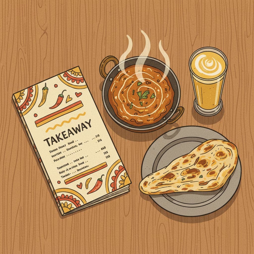
A takeaway menu isn't a list of food. It's the most important sales tool in your business — the thing every customer reads, every single time, before deciding what to spend.
Most independent UK takeaways treat menus as documents — a list of dishes with prices, sometimes laid out in dense columns of grey text on a white PDF. They've been the same for years. They were built by whichever printer was cheapest at the time. Nobody ever sat down and asked the question: does this menu actually make people order more?
Below is what actually moves average order value, what the research consistently shows, and how to redesign your menu (paper, online, or on Just Eat) without spending a fortune.
Why the menu matters more than you think
The math is simple. A 100-cover-a-day takeaway with an £18 average order value does £540,000 a year. Lift that AOV by just £2 (to £20) and you've added £60,000 a year — without serving a single extra customer.
Menu design is one of the highest-leverage things in the business. A well-engineered menu can lift AOV by 15–30% within a few months — far more than most marketing campaigns ever do.
The principles behind this aren't guesswork. There's decades of research on menu psychology — pricing, placement, photo strategy, descriptive language — most of it from Cornell University's food research labs and from restaurant operations consultancies.[1][2] The takeaways below are built around what consistently moves orders.
1. The "anchor and offer" pricing structure
If your menu is one column of dishes with one price each, you're missing the most important pricing tool: the anchor.
When a menu has one expensive item visible — a "premium" version, a sharing platter, a special — every other item on the menu suddenly looks better-priced by comparison. The customer who would have ordered the £8 chicken curry now feels comfortable ordering the £10 lamb special, because there's a £24 family platter on the menu making £10 look reasonable.
How to apply this:
- For each main category, include one "premium" option priced 2–3x your average
- This anchor doesn't need to sell a lot — it just needs to exist visibly
- Examples: a "chef's special seafood biryani £24," a "family platter for 4 £45," a "wagyu burger £18"
Most takeaways won't sell many of these. They'll still lift the average order value of everything else by 5–15%.
2. Lose the £ symbol (and the trailing zeroes)
This sounds trivial. It isn't. Cornell's menu research consistently finds that prices written as "12.50" outperform "£12.50" — and "12" outperforms "12.00".[1]
The reason: the £ symbol triggers an explicit "this is money I'm spending" thought. Without it, the number reads more like a quantity. Trailing zeroes (.00) over-emphasise that this is a price.
The same dish at "£12.00" vs "12.50" — customers consistently order the latter more, despite it being marginally more expensive. This effect is real and reproducible.
For online ordering systems that force a £ symbol, you're stuck with it. For your printed menu, your A-board chalkboards, your Just Eat photos and your PDFs — strip them.
3. The right-side advantage (and the bottom-right death zone)
Eye-tracking studies of menu reading show consistent patterns:
- Eyes go top-left first, then sweep right, then down
- The top of the right column is the highest-attention zone on a single-page menu
- The bottom-right is the lowest-attention zone — where dishes go to die
Practical implication: put your highest-margin, highest-priority dishes in the top-right of each menu section. Put items you wouldn't mind selling fewer of in the bottom-right. Don't put your best lamb karahi at the bottom of a long list — nobody will see it.
For a digital menu (Just Eat, your own site), this changes — most digital menus are single-column scrolls. There, the principle becomes: first three items get 60–80% of orders. Make them count.
4. Descriptions that actually sell
Compare these two:
Lamb Karahi — £11.50
Slow-cooked lamb shoulder, simmered with hand-crushed tomatoes, ginger, and our signature green chilli oil. Finished in a charcoal karahi pan. — 11.50
The second one consistently outsells the first by a meaningful margin in research and in our client work. Cornell studies have measured uplifts of 27% in dish sales when generic names were replaced with descriptive ones.[1]
The principles for restaurant descriptions:
- Specificity beats generality — "hand-crushed tomatoes" beats "fresh tomatoes"
- Cooking method matters — "slow-cooked," "charcoal-grilled," "tandoor-roasted"
- Origin or family terms work — "grandmother's recipe," "Karachi-style," "Punjabi village"
- Avoid adjective overload — three good details beat eight weak ones
- Don't lie or exaggerate — customers can tell, and they remember
What to never use:
- "Delicious" (everything on the menu should be delicious — saying it adds nothing)
- "Mouth-watering" (cliché trigger)
- "Best in town" (cliché + makes you sound desperate)
- "Famous" (unless you're actually featured in published media)
Aim for 8–18 words per dish for your top sellers. Shorter for generic items.
5. Photos: more is not better
The instinct is to put a photo on every dish. The research and our experience says the opposite: photographs on every item dilute attention and reduce overall conversion.
Why: when every dish has a picture, none stand out. The customer scrolls past all of them. When only your top 5–8 items have photos, those items dominate orders — which is what you want.
Pick the items where photos help most:
- Highest-margin dishes (the ones you want to push)
- Visually striking dishes (a bubbling karahi, a stacked burger, a crispy fish)
- Dishes new customers would be unsure about ("what does that look like?")
Skip photos for:
- Side dishes (rice, naan)
- Items where the photo wouldn't add anything (tea, water, salad)
- Items you don't particularly want to push
This applies to printed menus AND digital. On Just Eat, applying this discipline to the top of your menu meaningfully lifts conversion.
6. Group dishes by category — but be honest
A long list of 80 dishes overwhelms customers. Eight categories of 10 dishes each works much better. Common takeaway categories that read well:
- Starters
- House specials (this is where premium-margin items go)
- Curries
- Tandoori
- Biryani
- Sides
- Breads
- Desserts
Two principles:
- "House specials" is gold real estate. Put your highest-margin dishes here, even if they technically belong in another category. "House specials" implies these are the chef's recommendations — which is exactly the framing you want.
- Don't fake the categories. A "fresh from the sea" section should genuinely have fish dishes. A "from our tandoor" section should have actually been near the tandoor. Customers smell desperation; the menu should feel curated, not stretched.
7. The "set menu" (the one almost no takeaway uses well)
A pre-built set menu — "Family Feast for 4 — £45" — is one of the highest-leverage menu items you can add. Three reasons:
- It's an order shortcut. Indecisive customers default to it because they don't have to think.
- It controls the basket size. A four-person family on a Friday night ordering individually might spend £55. The set menu price-anchors them at £45 — but you've also controlled the food cost, so your actual margin can be higher.
- It signals abundance. A menu with two or three set offerings looks more generous than the same menu without them, even if the underlying prices are identical.
Build at least three set menus:
- A "Two-person dinner" (~£25)
- A "Family meal for 4" (~£45)
- A "Sharing platter / starter feast" (~£18)
Make them visually distinct on the menu — boxed off, with a slightly different background, ideally with one photo.
8. The strategic placement of high-margin add-ons
The £1.99 dessert. The £1.50 mango lassi. The £2 garlic naan. These are the dishes that turn a £16 order into a £20 order — but only if they're impossible to miss.
Where to place them:
- At the end of the main dishes section (so they're seen in context with mains)
- Bundled with set menus ("upgrade with a dessert for £2")
- On Just Eat: as cross-sell prompts at checkout if your platform allows
- On printed menus: in a small box at the bottom of the menu — "make it a meal: add a side, add a drink, add a dessert"
A consistent £2–£3 add-on rate across 200 weekly orders adds £400–£600/week in pure margin. This single tactic, done well, often pays for the menu redesign within a fortnight.
9. Allergen and dietary labels — legally required AND a sales tool
UK food businesses are required by FSA rules to provide allergen information clearly.[4] Most takeaways do the bare minimum (a tiny "ask for allergen info" line in 6pt text at the bottom).
Better approach: small icons next to each dish — "V" for vegetarian, "VG" for vegan, "GF" for gluten-free, "🌶" for spice level (1–3 dots). These help two ways:
- Compliance — clearer than the "ask staff" disclaimer
- Sales — vegetarians and vegans actively look for V/VG markers and skip menus where they have to ask. Same for spice-tolerance ("Is this very hot?")
A dish marked "V" sells more to vegetarian customers, who are a real and growing segment of UK takeaway buyers.
10. The redesign rollout plan
Here's how to actually update your menu without disrupting service:
Week 1: Audit
- Print your current menu
- Mark which dishes are best-sellers (top 10), which are mid-tier, and which barely sell
- Identify your 3 highest-margin dishes
Week 2: Restructure
- Move the three high-margin dishes to top-right of their section
- Add or improve descriptions on top 10 items
- Strip £ signs and trailing zeroes
- Build 2–3 set menu options
Week 3: Photography
- Get proper photos of your top 8 dishes (food photographer for half a day, or carefully shot iPhone with window light)
- Upload to Google Business Profile, your website, and Just Eat in parallel
- Old photos: delete them
Week 4: Print and roll out
- Print 100 copies of new menu (don't print 1,000 yet — you'll iterate)
- Update Just Eat menu, your direct ordering site, and Deliveroo simultaneously
- Track AOV for the first two weeks vs the same period last year
The mistake most owners make is updating one channel and forgetting the others. The menu on your website, your delivery platforms, your printed leaflets, and your Google Business Profile photos should all be the same. Inconsistency confuses customers and hurts ranking.
The honest summary
A great takeaway menu does three things:
- Guides the customer toward dishes that are good for them and good for you
- Sells through descriptions, structure, and visual hierarchy
- Defines the brand — the menu is often the most-read piece of marketing your business produces
Most independent UK takeaways have none of these. They have lists. The takeaways that fix this — properly, once — see AOV lift within a fortnight and never look back.
Pick three things from this guide. Update your menu this week. Test it for a month. Whatever moves your AOV the most, double down on. Whatever doesn't, drop.
The kitchen does the hard part. The menu shouldn't be the thing limiting how much customers spend.
Sources & further reading
We help UK restaurants and takeaways grow online. Get in touch for a free audit.